Client Overview
VT Skin Co. is a local esthetics spa with a brand identity rooted in softness, care, and elevated self care. They came to me with an existing logo concept they liked, but they felt it needed refinement to better reflect the quality of their services.
The Challenge
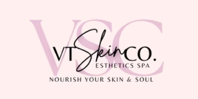
The brand had gone through several logo renditions, but their full lock up had become visually crowded. The script watermark overlapped the lettering in a way that made the hierarchy unclear and reduced readability. They wanted a logo that still felt like “them” but carried a more polished, modern presence.
The Goal
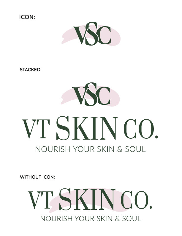
Refine the existing concept (shown below) without losing its essence. Improve clarity, hierarchy, and balance. Explore layout options that matched the client’s preferences while guiding them toward a solution that worked across print, digital, and merchandise.
The Process
Phase One: Exploration and Refinement
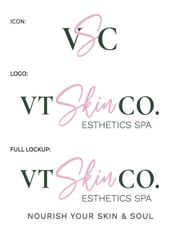
I began by developing several refined logo options for VT Skin Co. Each design kept the spirit of the original brand but introduced clearer hierarchy, stronger typography, and a more modern aesthetic. These initial concepts included variations for the icon, primary logo, and full lockup, allowing the client to see how each direction could function across their brand touchpoints.
A key part of this phase was updating the serif to a more elevated typeface and introducing a very dark green tone that paired beautifully with the soft script pink. I also corrected alignment issues so that all elements sat cleanly on the same baseline, which improved balance and professionalism. The “Esthetics Spa” text was updated to a more readable font, and both it and the tagline were unified using consistent typography and improved spacing.
These refinements brought immediate clarity to the brand. The client responded positively to the cleaner, more cohesive feel, and this set the foundation for the next round of decisions.
Phase Two: Explore a Connected Layout
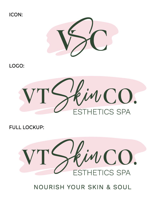
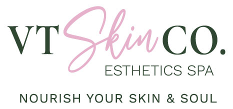
The client then asked to see a version that resembled their original placement with all elements touching.
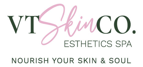
Both layouts used the same visual ingredients. The only difference was spacing, yet that difference changed the tone significantly.
When letters touch the script:
- More decorative and intertwined
- Script becomes the dominant focal point
- Feels boutique and romantic
- Slightly reduced clarity at small sizes or on embroidery
When letters do not touch:
- Cleaner and more modern
- Better readability across platforms
- More balance between elements
- A more elevated overall tone
After reviewing these details, the client agreed that the spaced version created a better visual experience.
Phase Three: A New Direction
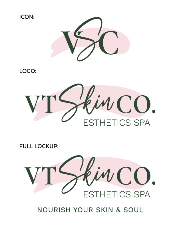
At this point, the client shared a new idea for a possible direction. I used their concept as a starting point, then refined the typography, proportions, and hierarchy to transform it into a polished final logo. This became the final logo design.
The Solution
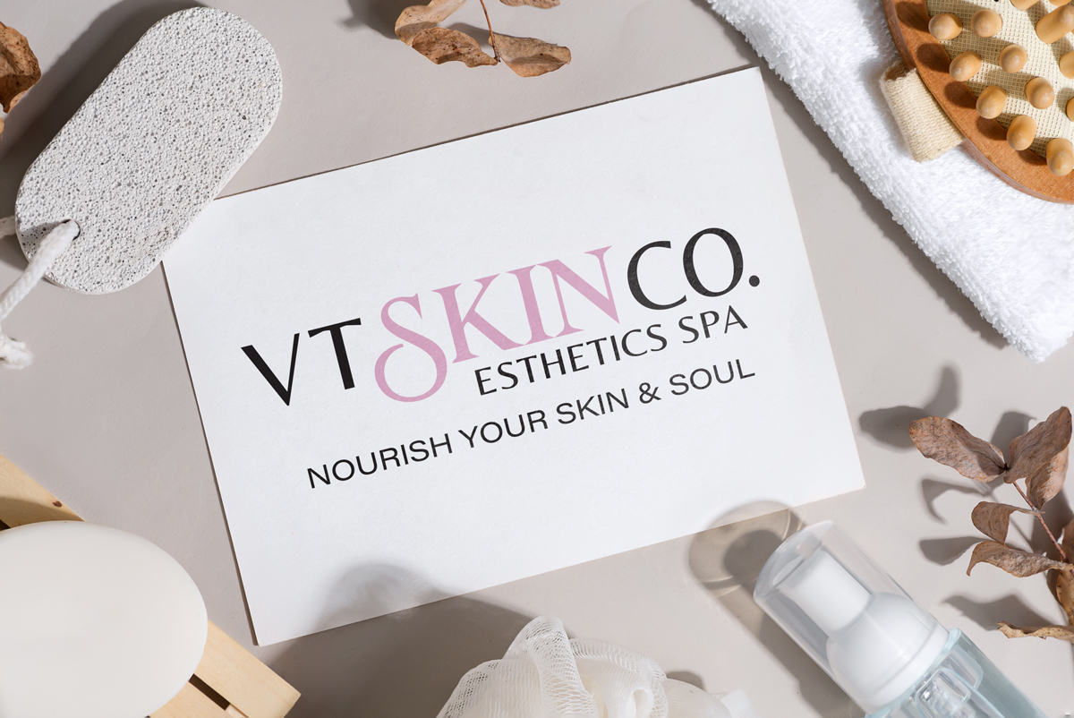
The final identity keeps the elegance of the script and the brand’s soft color palette, but presents it in a modern, readable, and versatile way.
Supporting Assets
I also created an icon that gives the brand flexibility on social, signage, marketing materials, and more.
A Collaborative Outcome
The final identity reflects a genuine collaboration. The client provided thoughtful input on layout preferences and type direction, and together we shaped a brand mark that feels clear, modern, and aligned with their vision.
