A Look Behind the Design
At Inspiration Media Solutions, I believe a brand grows just like the people behind it. Over time, it gains new clarity, new purpose, and a deeper understanding of who it truly serves. Ballou Family Apothecary stands for wellness that feels honest and uncomplicated. Gentle formulas, simple ingredients, and the kind of care that comes from a Vermont family that values integrity over trends. As the business grew, the visual identity needed to grow with it.
This rebrand was about bringing the outside of the product into harmony with what is on the inside. Ballou Family formulas are crafted with intention and purity, and the new look reflects that same sense of care and refinement.
Why the Rebrand was Necessary
Ballou Family Apothecary began with humble, rustic packaging that reflected its origins. The original packaging was created with intention, but did not resonate with customers or convey the experience of the product. Customers loved the magnesium butter and aromatherapy blends, yet the old look did not communicate the premium nature of the formulas or the thoughtful sourcing behind them.
The rebrand allowed the visual identity to rise to the same level as the product quality. It helped create a clearer first impression. It positioned Ballou as a Vermont wellness brand with luxury-level care while still feeling grounded, warm, and familiar.
Our Goals for the New Look
- More Luxurious and Elevated
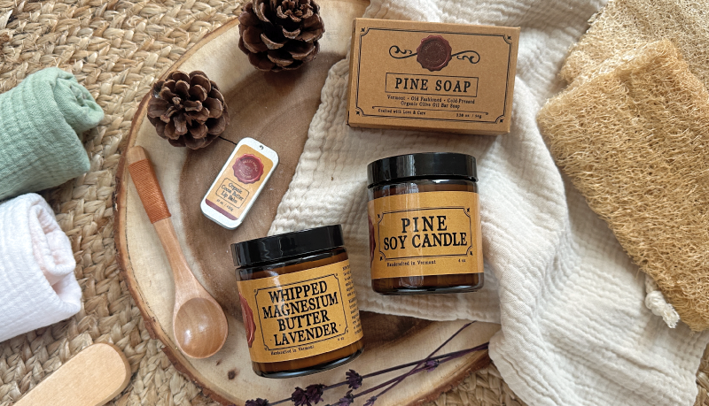
We set out to create packaging that felt luxurious and gift worthy without losing the heart of the brand. Amber jars are a core part of Ballou because they protect the integrity of the formulas. Rather than replace them, we chose to elevate them. Gold accents, refined typography, and a cleaner layout give the jars a more polished presentation while still feeling approachable and true to Ballou’s roots.
- A Natural, Non-Toxic Aesthetic
Ballou Family Apothecary products are crafted with clean, simple ingredients. The new design embraces that with a more minimal layout, gentle color palette, and fewer distractions. Customers can quickly understand what they are purchasing and why it is safe for their skin and home.
- Clearer Readability
The old labels held a lot of information that sometimes competed for attention. The redesign simplified the hierarchy. This makes the product easier to read, easier to understand, and easier to recognize from a distance.
- A Visual Identity That Can Grow
Part of the motivation behind the rebrand was preparing for expansion. New products were on the horizon, and the design system needed enough flexibility to grow with the line. The updated look provides consistency while allowing each product to have its own personality.
The Logo Redesign
The logo was an important part of this rebrand because the original mark did not reflect the strength or personality of the Ballou Family Apothecary brand. I did not design the original logo, and while it served its purpose in the early days, it had limitations that held the brand back. The circular layout was difficult to scale down and often lost clarity when used at smaller sizes. It also offered only one lockup with no secondary or simplified variations for social media, packaging, or future marketing needs.
A strong brand needs versatility. It needs a logo system that adapts and still looks intentional in every setting. Creating an updated mark allowed us to introduce cleaner typography, clearer hierarchy, and multiple lockups that work across digital, print, and packaging. The new logo feels more refined and more aligned with where Ballou Family Apothecary is headed, while staying connected to the heart of the brand.
What This Rebrand Means for Ballou Customers
Most importantly, the rebrand reflects a promise. When customers pick up a Ballou Family Apothecary product, they can trust that what they see on the outside matches what they will feel on the inside. Calm, comfort, and care are now communicated instantly through the packaging.
Quality has always been the foundation of Ballou Family Apothecary. The new identity expresses that quality more clearly. It honors where the brand began and creates space for where it is headed.
A Thoughtful Evolution
Rebranding is not about replacing what came before. It is about listening to what the brand has become and giving it a look that honors its truth. For Ballou Family Apothecary, this was a natural next step. A quiet shift from flannel to black tie. A move toward a more refined exterior while keeping the same heartfelt, crafted formulas that customers already trust.
Co-founder Dawn Lancaster played a meaningful role throughout the redesign. Her vision for how the brand should feel guided many of the decisions we made along the way. She wanted the packaging to express the same warmth, care, and intentional simplicity that she brings to every formula. Having her insight throughout the process ensured that the new visual identity stayed true to the heart of Ballou Family Apothecary while growing into a more refined and future ready version of itself.
It was my privilege to help shape this evolution. And we are excited to see how this refreshed identity supports the next chapter of growth.